Niebla
Research and development for a typeface that improves the legibility of the Mexican road sign system.
Resistance of memory
Strategies for not forgetting
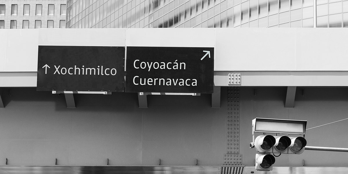
Traffic signs in Mexico have legibility problems that are found in every kind of road sign. Both highway and urban signs have design problems that can be understood in two main categories: poor and inconsistent design, and presence of several typefaces that are not fit for information display.
Even though there is a big manual on how to design and build road signs, the reality on the streets and highways is a different thing altogether.
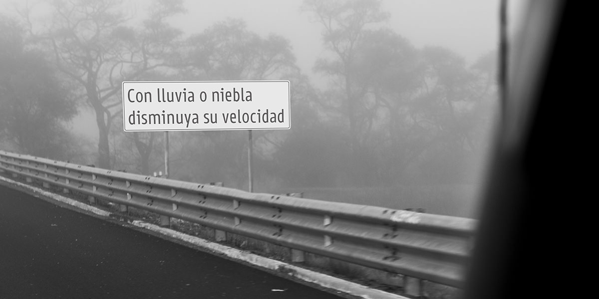
Several typefaces may be found in the city, and the typesetting some cases may be slightly off, whereas in others it shows a complete disregard for legibility or typographic common sense.
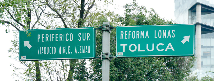
Historical research shows that the Mexican road sign system was built with heavy references to the UN conventions and to the American road sign system, as well. Taken from the Geneve Convention of 1948, the Mexican road system has its structural core in a set of pictograms and graphic devices that “should be used whenever possible and instead of inscriptions” in order to maximize legibility, avoiding language barriers and analphabetism. The visual language, on the other hand, is inherited from the American system, all the way down to its typeface, the ubiquitous FHWA series, AKA Highway Gothic.
Despite its formal legibility issues, Highway Gothic wasn’t designed with linguistic considerations and requisites others than those found in the English language. Originally, the typeface didn’t have the ñ letter, a staple glyph in spanish typography, or any diacritical marks. And even though the family system is comprised of 5 different widths –from the condensed to the extended– it was not designed with the language in mind.
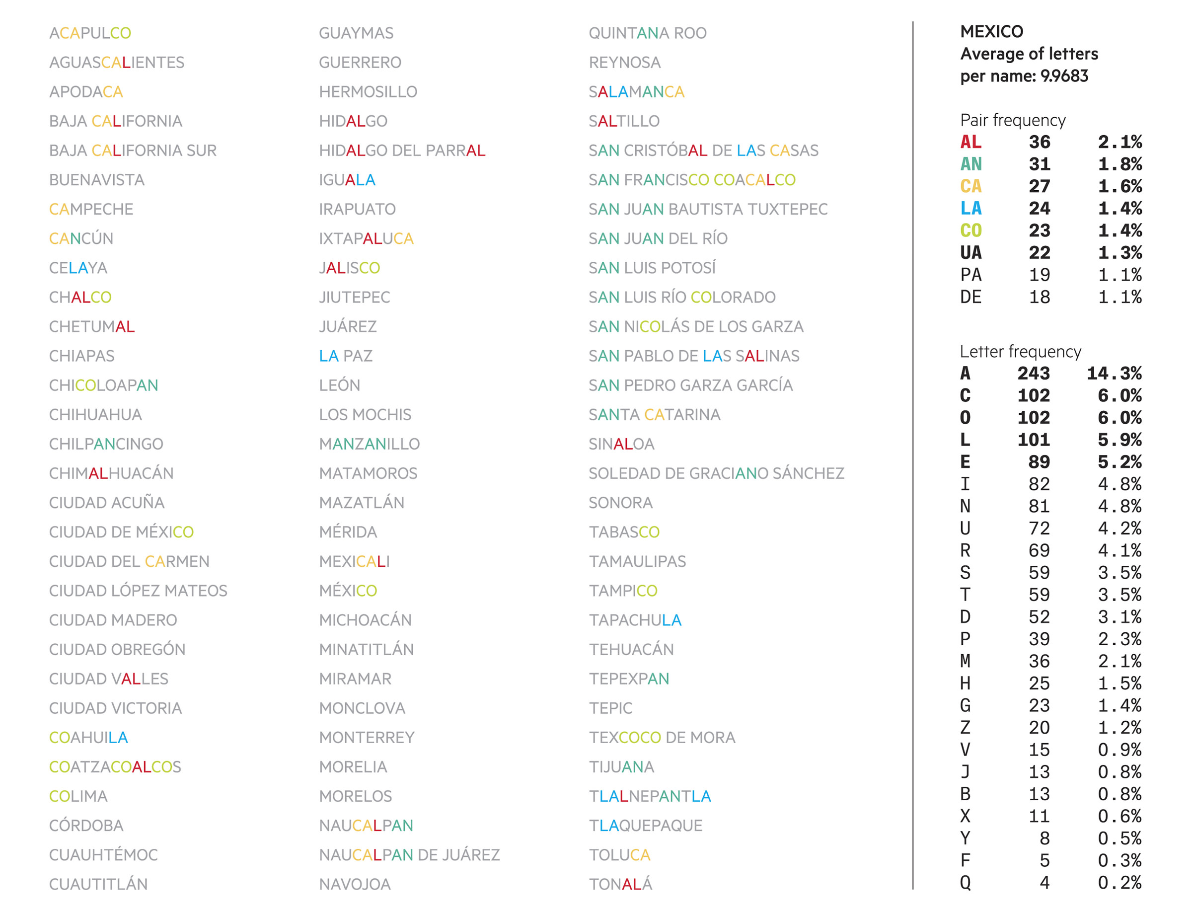
The Wide and Extended cuts are practically useless with words longer than five or six characters, due to the size constraints of the sign board. This may seem quaint and a problem seldom encountered. In the New York state, for example, the average destination name has 6.8 characters, as discovered in this project. However, it becomes more relevant when it is taken into consideration that the average Spanish (in Mexico) destination name is a whopping 12.3 characters per name.
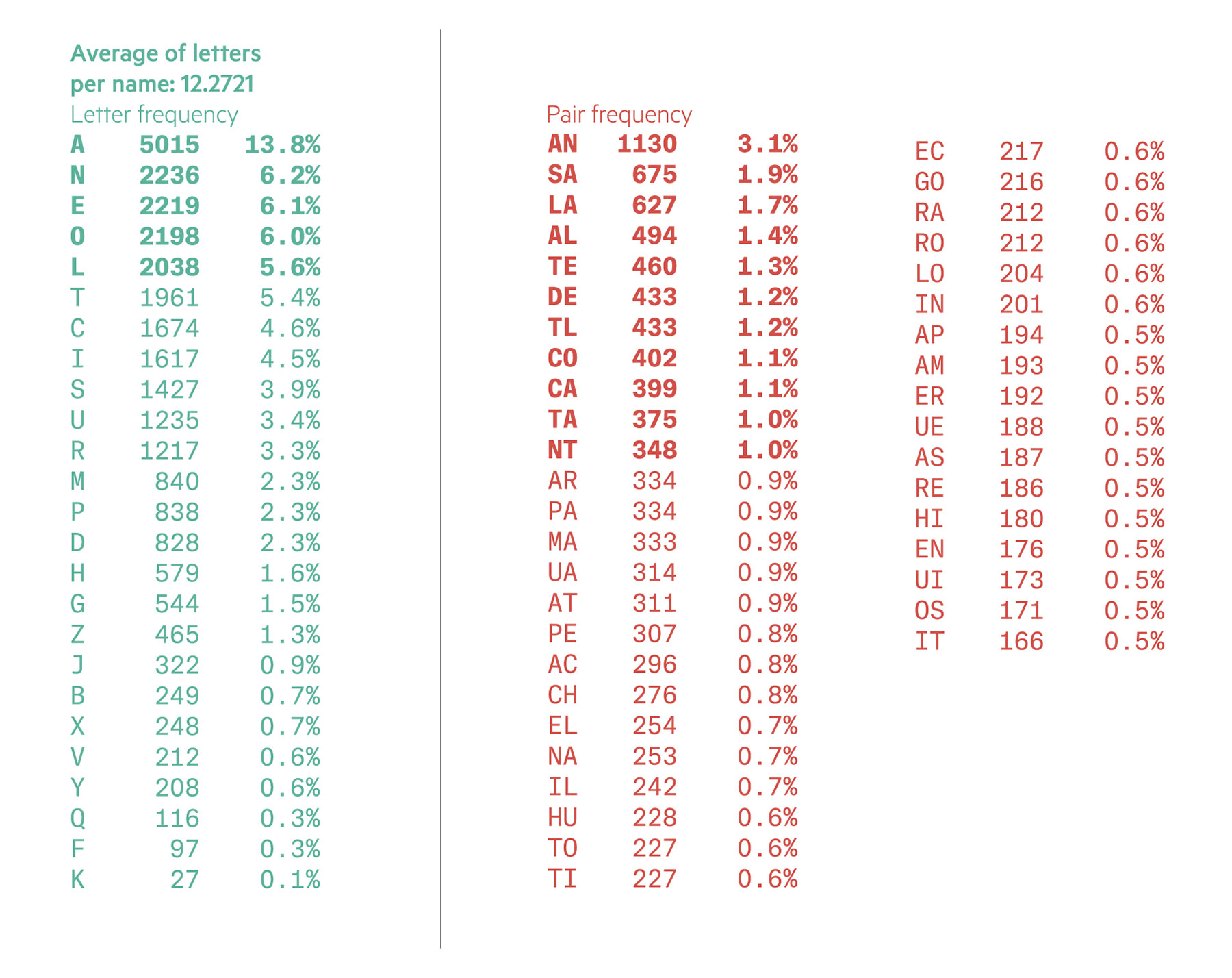
In such a context, it becomes clear that extended cuts are not useful, and more emphasis should be directed to the narrower fonts. Of course, a letter can be compressed only so much before it ceases to be understood. How much stress it can resist before unreadability, on the other hand, can be enhanced by the design of the letterforms. In addition, Mexican names have a very particular structure, statistically speaking. The most common letters, letter pairs and letter triads are different from the Spanish in Spain or other hispanic countries, mainly due to the large numbers of etimologies from nahuatl, mayan, and other indigenous languages.
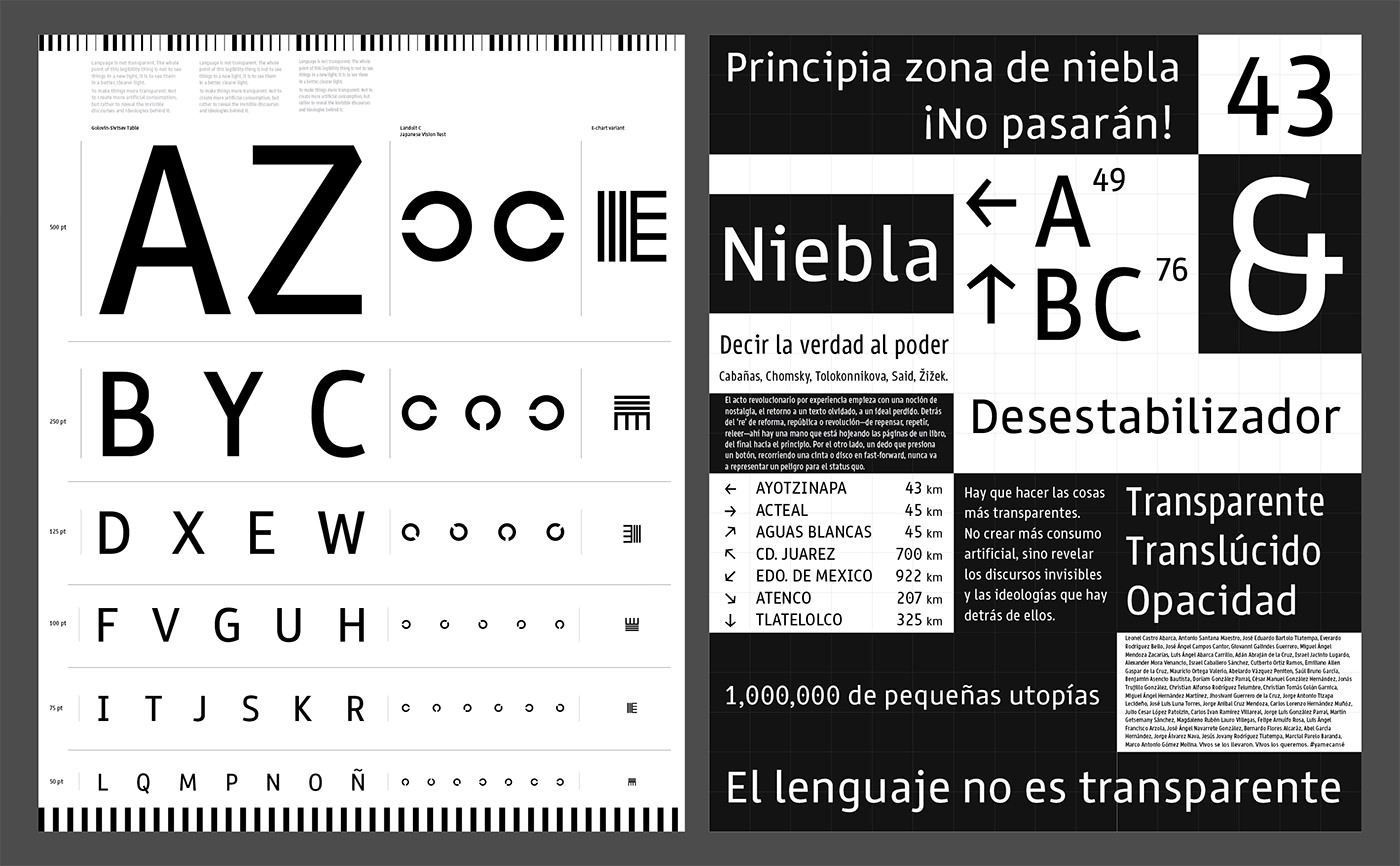
Letter Forms
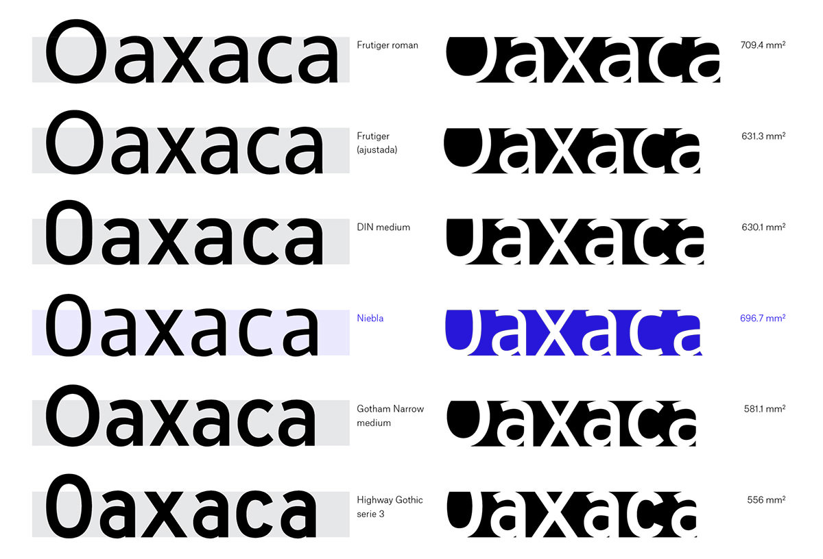
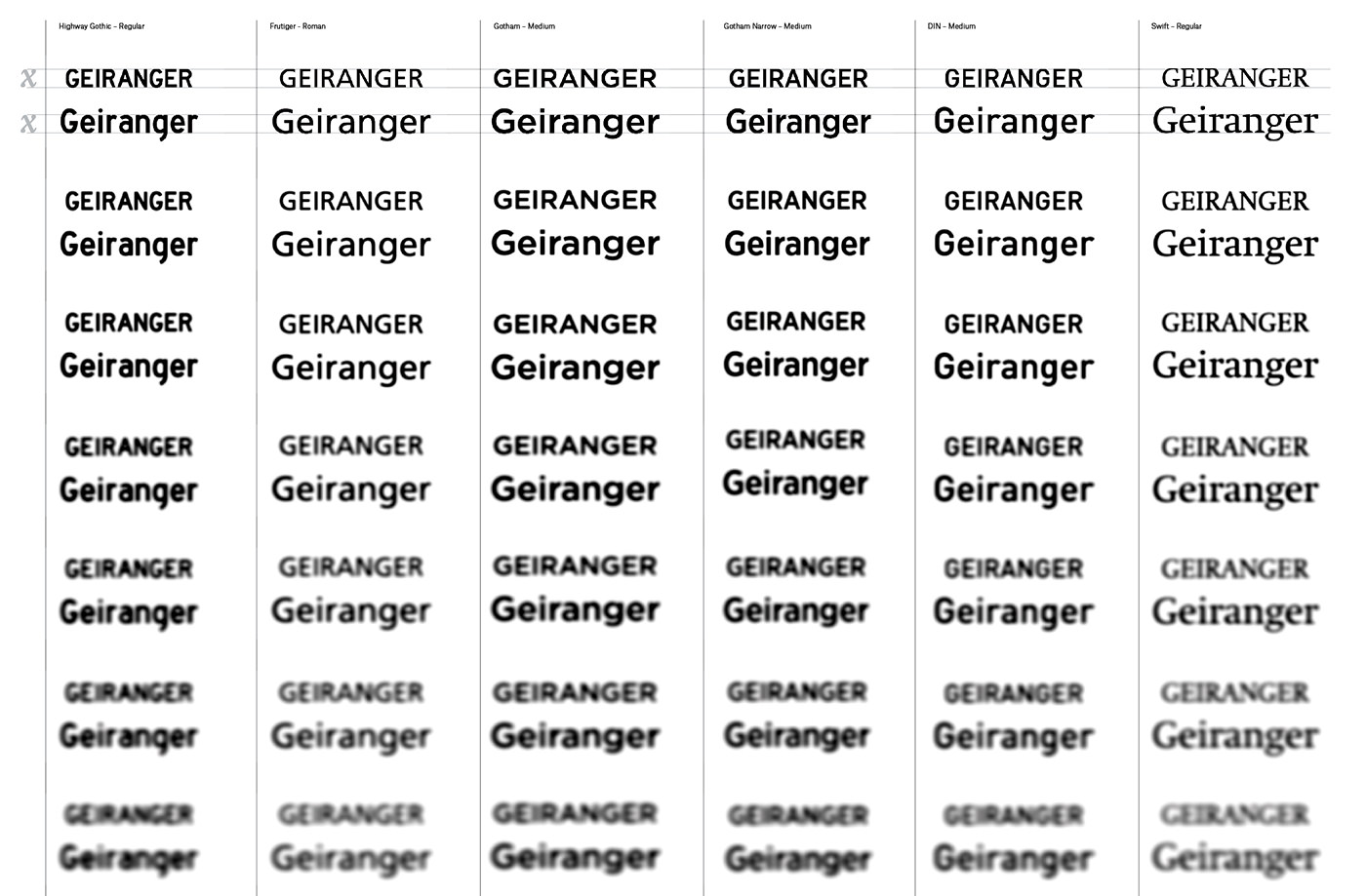
Studying the shapes of other legibility and wayfinding champions, a common theme were the open counters. How much ‘openness’ is needed? What is the influence of stroke thickness? What about counters and white space between letters?

To have a concrete reference, an area comparison was made among Frutiger, DIN, Gotham Narrow, Highway Gothic and Niebla. The same word was set on a fixed rectangle, whose height was used as the x-height for all faces. Afterwards, everything that was above or below the x-height rectangle and out of the word extremes was erased, and then the remaining area was measured. Not surprisingly, the word with the largest internal area was set on Frutiger. However, it was also the most ‘extended’ in the group. When a little horizontal compression was applied in order to render it closer to the other words’ width, its area fell second to Niebla’s internal footprint.
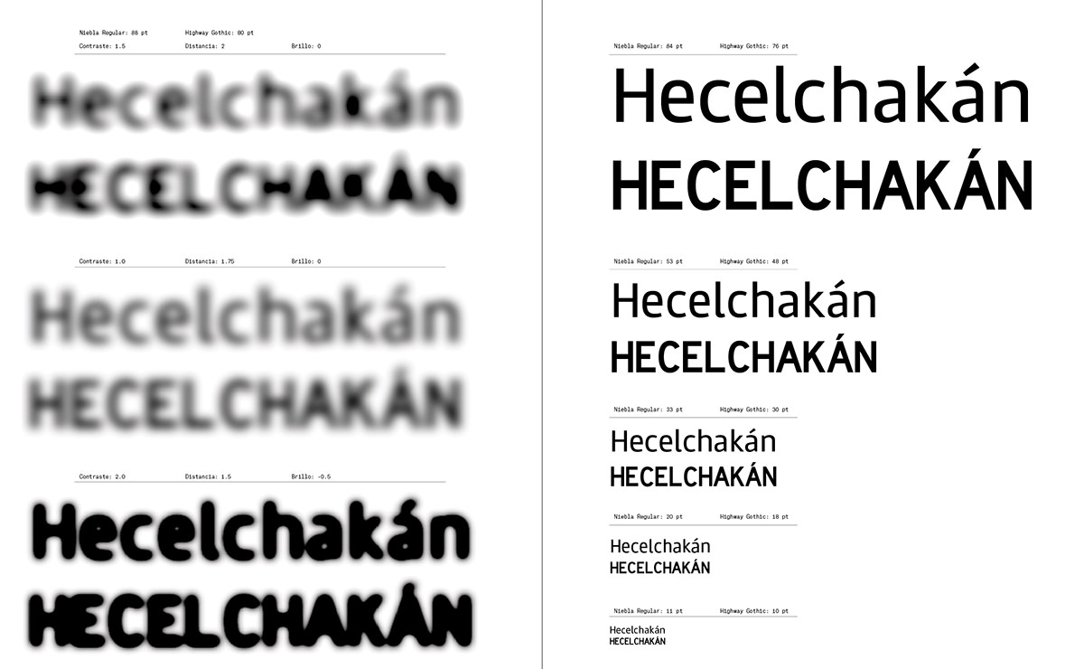
Throughout the design process, resistance to typical road stress conditions was tested and considered in the development of the letterforms. The key legibility-enhancing features of Niebla are created by the x-height, stroke thickness and counters aperture. The lowercase, which was found to be better suited for the Mexican territory’s linguistic characteristics, was carefully considered.
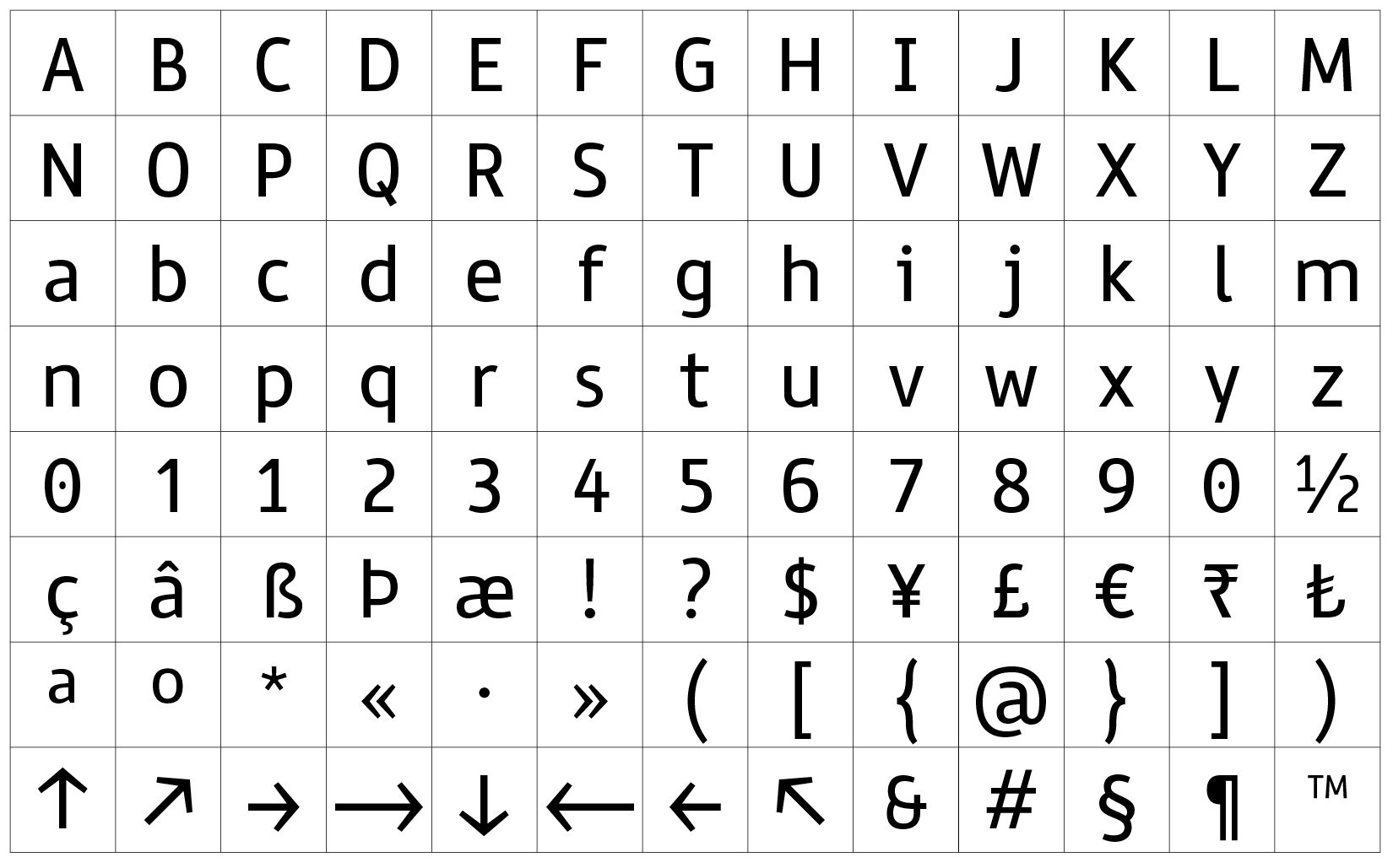
The Typeface
The Niebla family consists of three cuts: Regular, Narrow and Condensed.
It is important to underline that a typeface is only a means to an end. A typeface may be legible, but it can’t make a message more or less legible on its own. A typeface, like any other tool, can be used to show, to conceal or to distract. Such scenarios are out of the scope of this project. However, these letters are made to enhance legibility and hopefully they will be used to make things more transparent.
The essence of legibility is not within a style, but in the content.